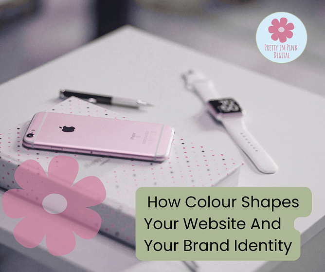
When launching or growing a business, many people focus on what their website says or does, but not always how it feels. That ‘feel’ often comes down to colour. As someone who helps small businesses around New Zealand get their websites looking just right, I know that the colours you choose can have more impact than you might think. Colour isn’t just about making your branding look pretty — it sets the mood, builds trust, and helps your business stick in people’s minds. Whether you’re starting fresh or giving your brand a makeover, thoughtful colour choices can make it easier for your dream clients to connect with you online. In this blog post, I’ll walk through why colour matters so much for websites and branding, share tips for creating the right colour palette, and show how colour can support both style and usability. Let’s dive in and add some confidence to your colour decisions!
Colour Tells Your Story Before Words Ever Do
When someone visits your website, colour is usually the first thing they notice, often before reading a single word. Colours send signals to the brain and help shape the first impression. For example:
- Soft pinks and pastels can create a gentle, welcoming vibe — great for creative or wellbeing brands.
- Blues and greens often feel calm and reliable.
- Bold reds or oranges can feel energetic or urgent.
It’s not just about personal taste. These colour associations are built from culture, psychology, and even current trends. Choosing the right palette means tuning in to how you want people to feel when they see your site — trusting, excited, relaxed, adventurous, and more. I often suggest starting with one main brand colour (something unique to your business), then supporting it with lighter or darker shades for depth. Use these colours across your logo, website, social media, and print materials to help your brand look united and professional. Getting colour right means telling your story even when you’re not there to do it in person.
The Subtle Power Of Colour In Guiding User Experience
Colour has a technical side too, especially in web design. It’s not just about how things look; it’s about making your site easier for visitors to use. For example, using a strong, contrasting colour for calls to action (like “Book Now” or “Contact Me”) helps turn visitors into enquiries or sales. Key points to remember:
- Readability should always come first. Make sure your text is easy to read against your background. Not enough contrast can frustrate visitors and even cause them to leave.
- Navigation clarity is boosted when important buttons or links stand out with colour.
- Focus and flow rely on colour — soft neutrals can guide the eye naturally and let your main messaging shine.
Overdoing colour, though, can have the opposite effect, making things overwhelming or distracting. At Pretty in Pink Digital NZ, I favour clean, friendly designs with a splash of personality. Picking just a few colours and using them purposefully will help users enjoy your website and understand what action to take next.
Building Trust And Recognition With Consistent Colour Use
Consistency in your colour choices is a big part of brand recognition. If your logo, website, and business cards all share a common palette, you’re building a visual identity that people will remember. Over time, your colours can become as much a part of your business as your name. For example, think of how instantly you recognise popular brands by their unique colours — that’s the power of consistency.
Here’s how I help clients stay consistent:
- Create a brand style guide — even a simple one — listing your main and accent colours.
- Always use exact colour codes (like hex or RGB) instead of guessing shades each time.
- Apply your palette everywhere: website graphics, social media templates, packaging, and digital ads.
This doesn’t mean your branding can’t evolve. In fact, sometimes a colour refresh is just what you need to signal a change or attract new types of clients. But the key is being thoughtful and strategic, rather than random or rushed. Consistent use of colour across all your touchpoints builds trust and makes your brand easy to spot in a busy online world.
Bring Colour Confidence Into Your Next Website Project
Making mindful colour choices is about more than just looking appealing — it’s about setting the right tone, guiding your audience, and creating a memorable, professional image. At Pretty in Pink Digital NZ, my friendly, straightforward approach helps businesses make these decisions with clarity and purpose. If you’re working on your website or thinking of refreshing your branding, start by exploring colours that fit the personality and goals of your business. Test combinations for readability, check how your palette feels on both mobile and desktop, and don’t shy away from asking for advice if you get stuck. Remember, your colours say more than you think — make sure they’re telling the right story. If you need a hand, I’m always happy to chat about turning your ideas into a confident, beautiful brand online.